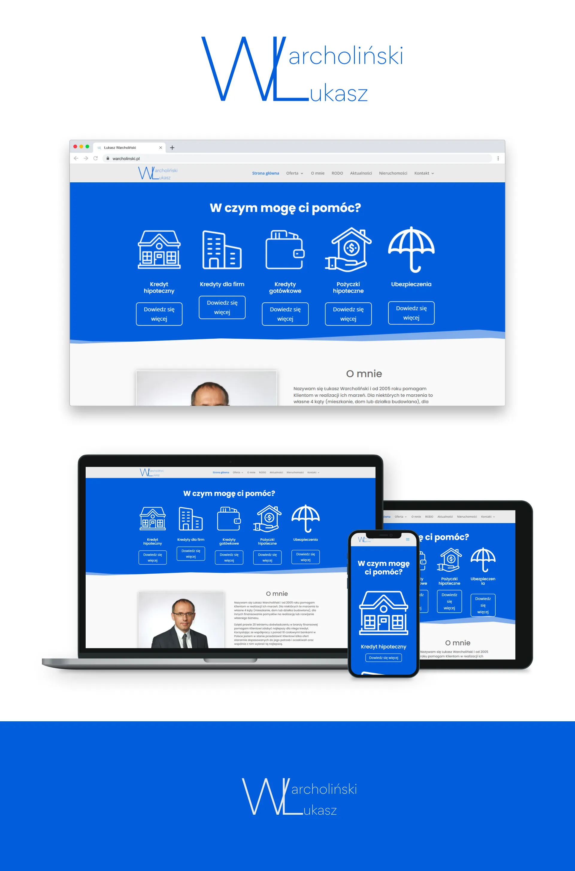
Context
An insurance agent needed an online presence built from scratch: a logo and a website that builds trust and leads to contact. In insurance, clients rarely browse for fun — they look for credibility, a clear scope of help, and a fast path to a conversation.
Goal
I designed the visual identity and delivered a WordPress site that:
- provides coherent branding (logo + site look),
- presents the agent’s offer / profile in a calm, professional tone,
- leads to contact without unnecessary friction.
My role
I owned design (Figma — logo and layout), solution design, WordPress implementation, and up to 30 days of post-launch care.
Scope
The January 2022 delivery included:
- branding from scratch — logo and visual direction,
- UI design in Figma (clean / minimal / responsive),
- WordPress implementation,
- offer presentation and a contact path,
- a structure the client can keep updating independently.
Project documentation: Behance — logo & website.
Approach
For insurance sites I avoid aggressive push marketing. I prioritise clarity, calm, and concreteness: who the agent is, how they help, how to get in touch. A minimal layout should reinforce trust, not distract.
Challenges
- Trust from the first screen — branding and typography must feel serious, without “cheap sales” associations.
- Starting from zero — logo and site as one identity, not a logo pasted onto a generic theme.
- Maintainability after handoff — the client should update content without a developer; WordPress reduces that dependency.
Outcome
The delivery was a full set: logo + a responsive WordPress site designed in Figma and implemented as a client-contact tool. I provided up to 30 days of post-launch care after go-live.
No live URL is linked in the portfolio — this case study is based on the delivered scope and Behance documentation.
Stack
- Figma — logo and UI design
- WordPress — content and contact implementation